// E-Learning Platform
PETRONAS Corporate Security Programme
Client
PETRONAS E-Learning Solutions (PELS)
Role
Experience Design,
Interface Design,
Interaction Design
// Background
Seamless training and upskilling for employees
When your workforce is enormous and operates in several countries, getting your employees to accustomed to your organization’s corporate cultures, policies and responsibilities can be quite challenging. Without proper communications channels, the messages oftentimes seen as confusing and misinterpreted which eventually impacted the productivity of the workforce.
PETRONAS E-Learning Solutions (PELS) was tasked to come up with a more effective way to train employees without negatively impact the productivity.
OUTFITS
SUBSIDIARIES
COMPANIES
// Proposed Solutions
Virtual automated training & evaluation platform - any time, any where
Instead of totally relying on physical training sessions for employees which require them to leave their tasks at hand for a certain period of time, PETRONAS E-Learning Solutions (PELS) has come up with a virtual solution that enables staff to undergone trainings required by the organization without being confined by time and locations.
Optimizing on the organisation’s vast private networks, PELS has proposed a comprehensive e-learning solutions that will not only able to provide employees with all related training materials needed for their works but also to have a comprehensive evaluation processes as validations.
// Fig. 01: The User Flow
// Targets & Goals
Ensuring efficient employees on boarding processes
Survey and interviews were conducted to gather information and feedback from employees to identify the pain points that existed in the current methods and to find out their expectations in the new ones. Based on the results of the survey and interviews, the design success metrics were segmentized into three different aspect:

User Friendly

Interactivity

Easy Access
// User Friendly
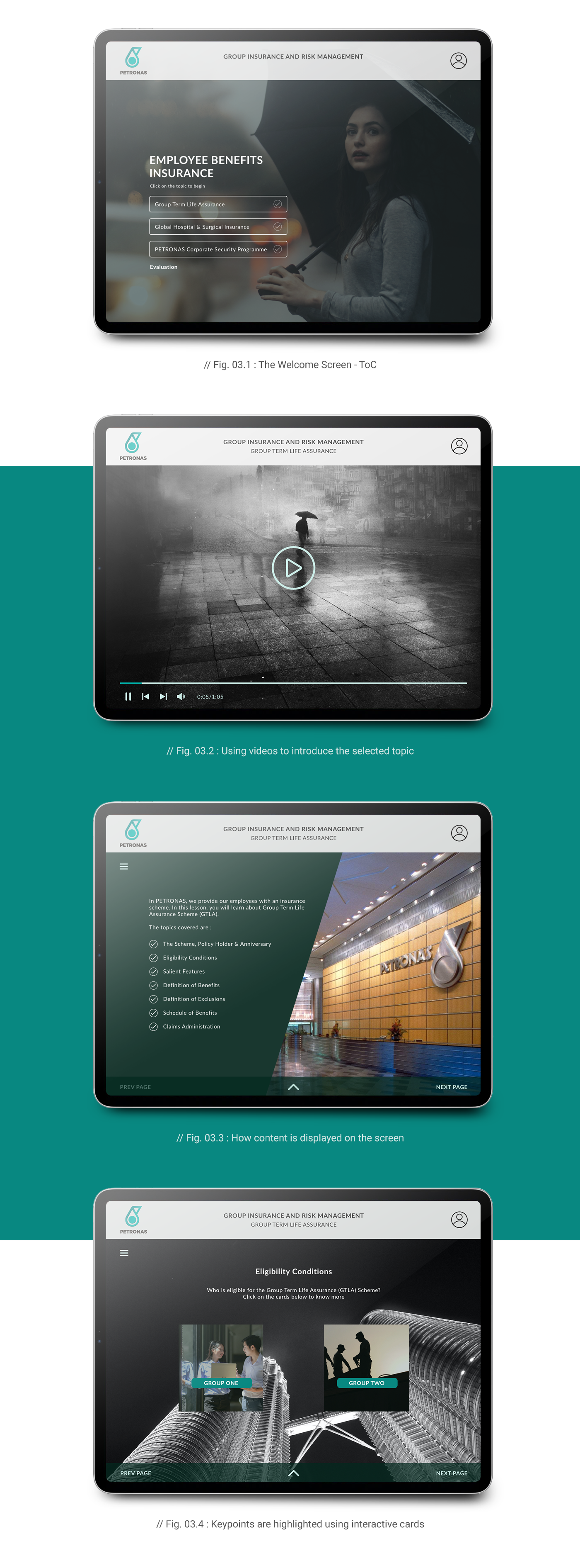
Consistent layout and structure, clear navigations and flexibilities
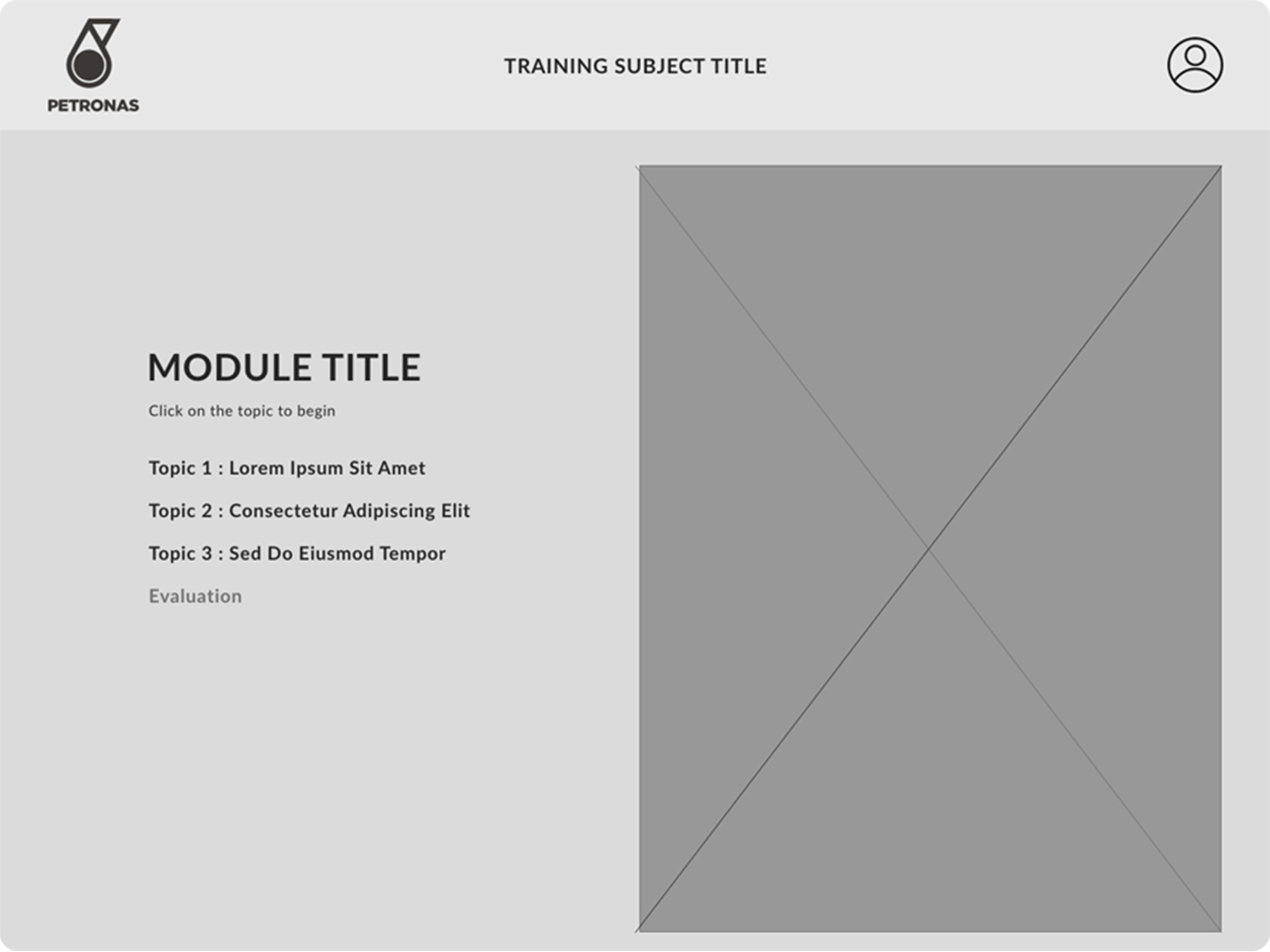
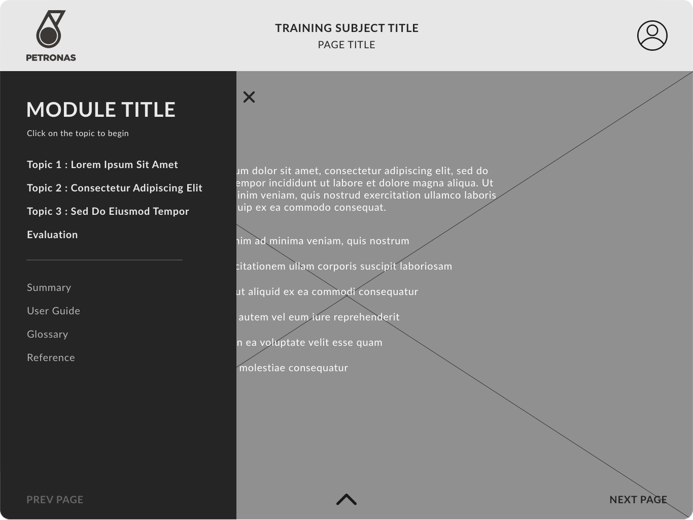
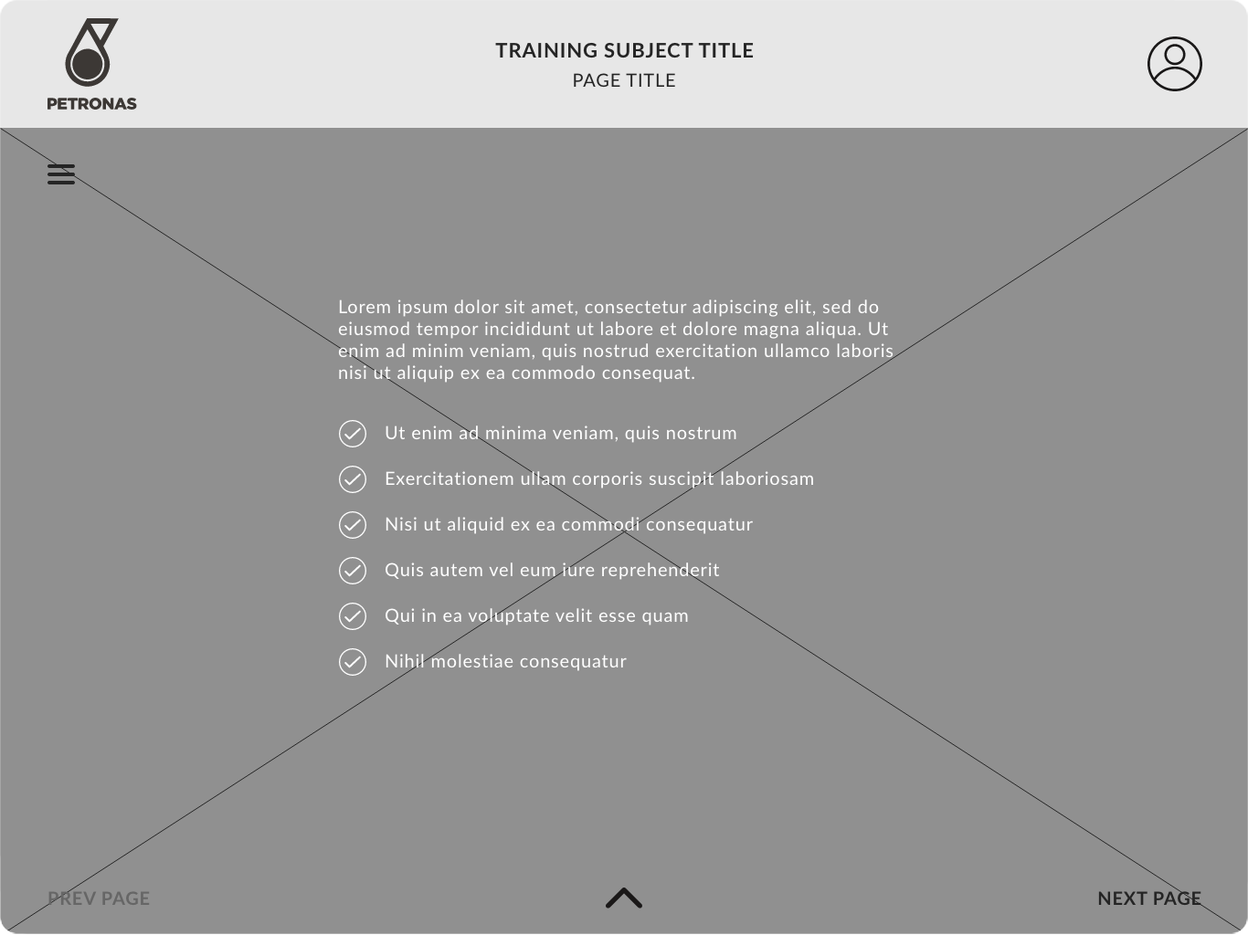
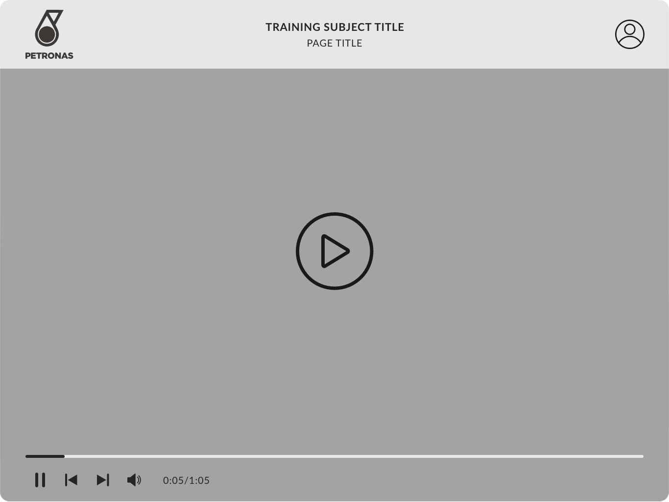
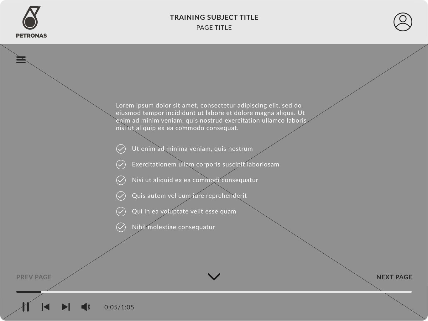
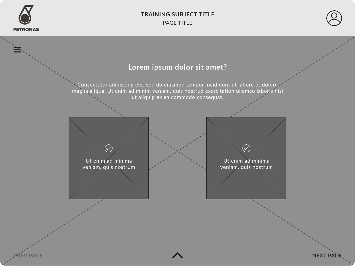
// Fig. 02: The Wireframes
// Gamifications
No boring stuff please…
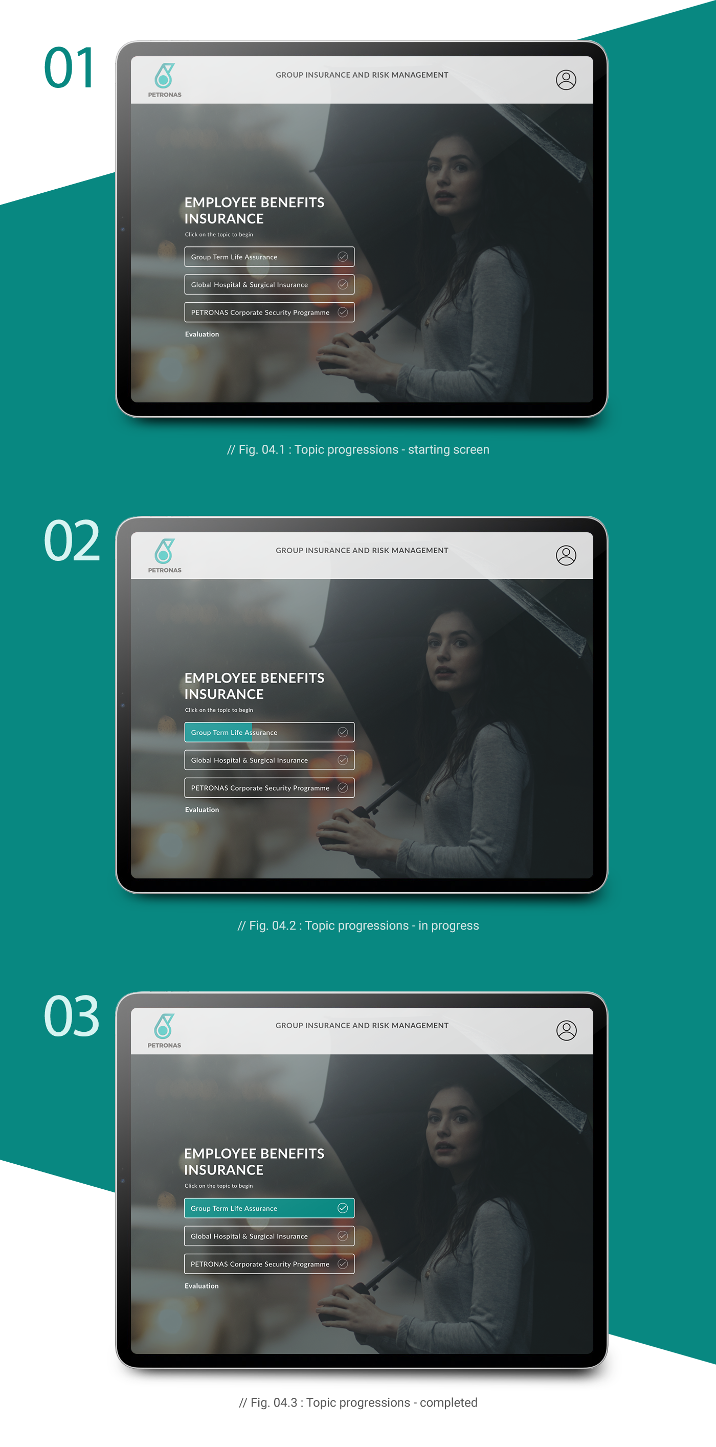
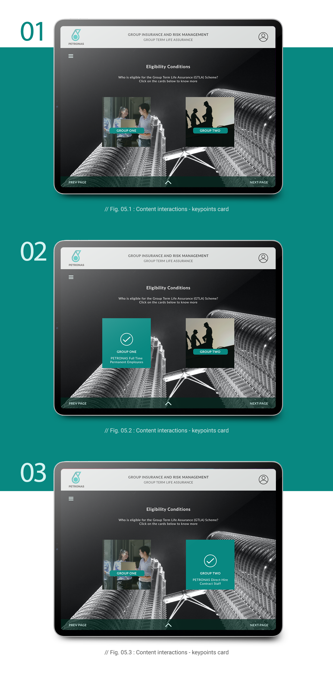
Through gamification, boring subject can be presented in a much more interesting ways. It also gives the ability to the user to gauge their understanding about the subject via interactive quizzes and tests - resulting in more focus and efficiency.
// Easy Access
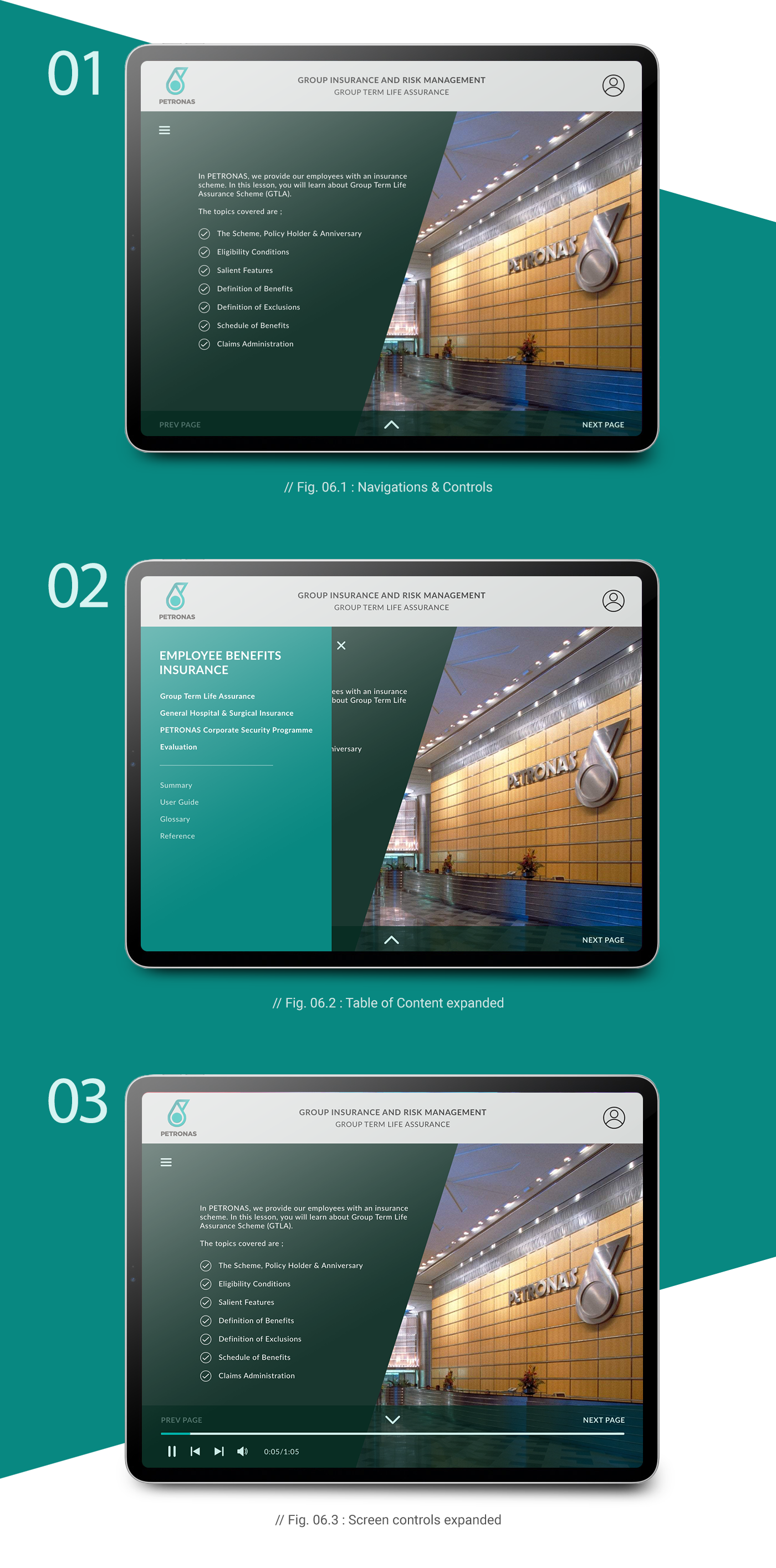
Play. Pause. Stop. Complete
// Conclusion
Increased skills, productivities and efficiency
Upon the completion of the first pilot module based on the data gathered prior to the design, series of test were conducted targeting several user groups from various departments, subsidiaries and work locations to see the feedback regarding the new platform. Based on the feedback on the test, the results show improvements in the following areas:
to navigate their ways easily throughout
the modules
presentations are more interesting
and engaging
able to complete the modules and
the evaluation much faster
