// Website
Corporate Website Mark III
Client
BTM Blockchain Technology (M) Sdn Bhd
Role
Experience Design,
Interface Design,
Interaction Design
// Background
Introducing a tech startup with a new tech and a new corporate culture
How do you explain your business when you are offering something that is so alien to most of the people in the country that you are operating in? This is the challenge that BTM Technology (M) Sdn Bhd faced when they first started out in Malaysia.
// Proposed Solutions
Give 'em "kisses" - "Keep It Simple, Stupid" with "Empathy and Solutions"
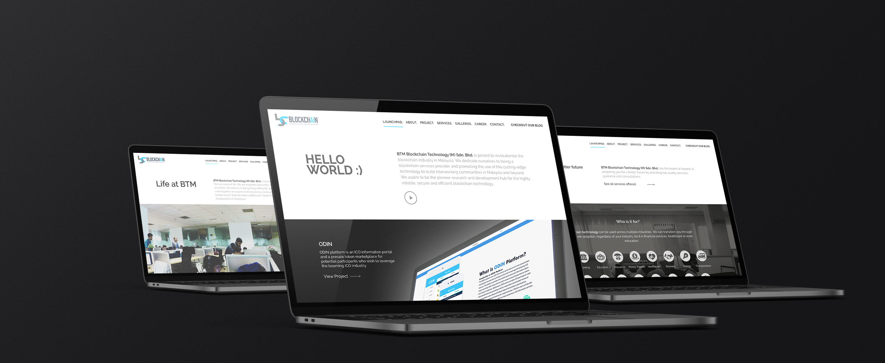
Most tech startup will opted for a more "tech-oriented" design in order to showcase their expertise and capabilities. BTM Blockchain Technology decided to try something different. Instead of showing all the glitz and the advance tech features, they wanted something that is simple and approachable.
The solutions? A minimalist layout with lots of whitespace so that the content can be properly highlighted using the tones that can be easily understood. The content is more focused on educating the visitors about blockchain technology and at the same time promoting the "cool" working cultures that the company promotes.
The solutions? A minimalist layout with lots of whitespace so that the content can be properly highlighted using the tones that can be easily understood. The content is more focused on educating the visitors about blockchain technology and at the same time promoting the "cool" working cultures that the company promotes.
// Targets & Goals
Educating the public about blockchain technology
At the time of this development, blockchain is still a new technology in this country. Most times, people would confuse blockchain with cryptocurrency. The aim is to educate the public about the true potentials of this new technology and how it can help create a more secure and tranparent transaction.
At the same time, the company also aim to attract the right talents (which is quite limited locally) and showcase an open and healthy working culture that promotes growth in terms of knowledge and skills for all its employee.
At the same time, the company also aim to attract the right talents (which is quite limited locally) and showcase an open and healthy working culture that promotes growth in terms of knowledge and skills for all its employee.
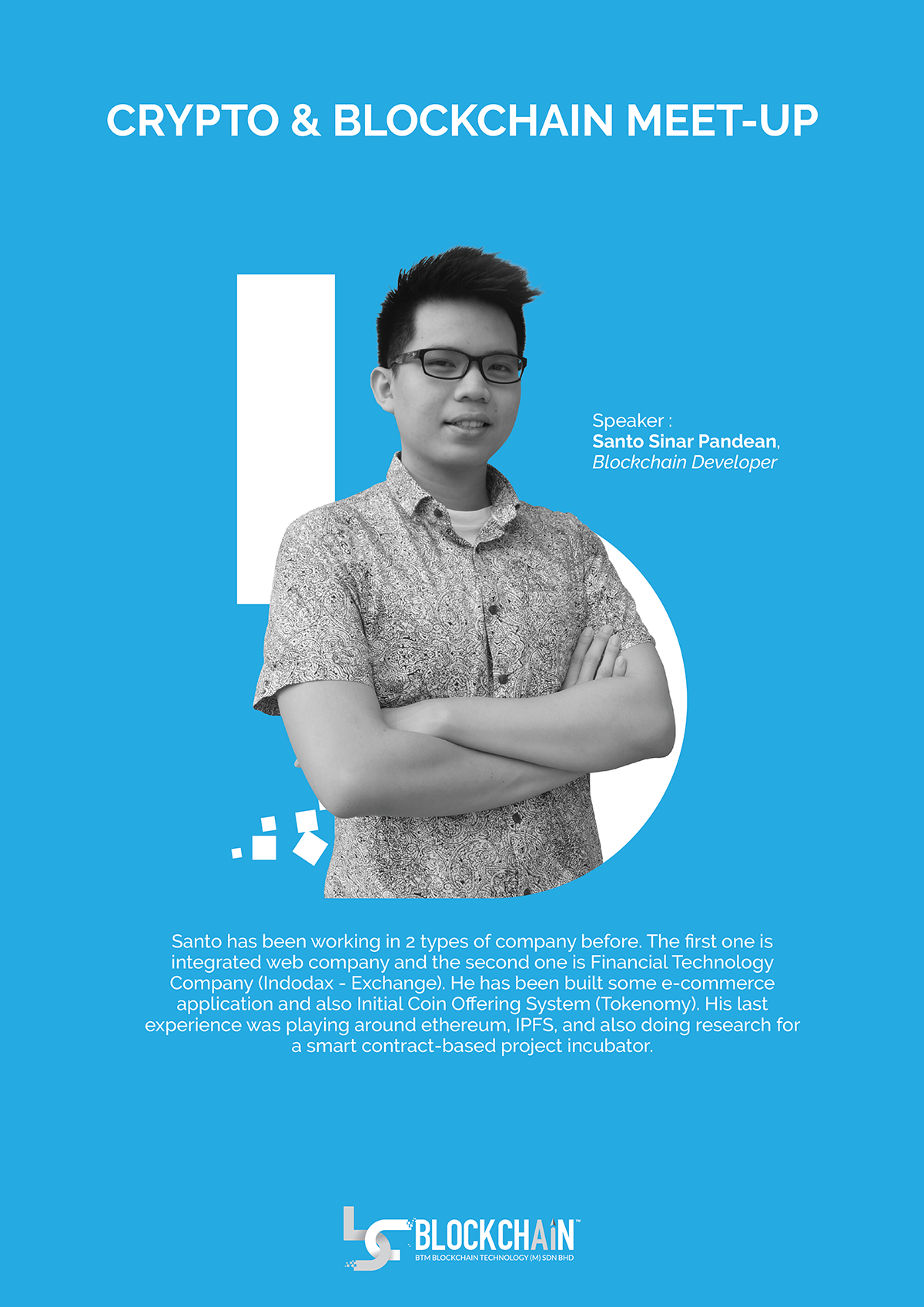

Educate
Providing comprehensive and easy-to-understand content - articles, media and training - on blockchain technology and its true and full potentials in providing reliable and secure data transactions for businessed in the country.

Declutter-ing-ness
Content are properly arranged in a way that its flow is easy to follow and understand, fully utilising the whitespace in order to ensure that the visitors can easily focus on the messages that are being conveyed.

Speak Human
The tones and voice in the write-ups were casual and friendly so that the website speaks human instead of pushing all the complex jargons and terms that create more confusions thanf clarity on each of the presented topics.
// Educate
Don't just explain, educate!
When coming up with the design, the first aspect that need to be considered is on how to present the information about this new technology in a way that make it easy for the public to understand the subject of blockchain. Multi-medias approach were use to create clear content structures that make the visitors feel that they are learning instead of just knowing about the subject.

// Declutter-ing-ness
Minimalist design creates more focus
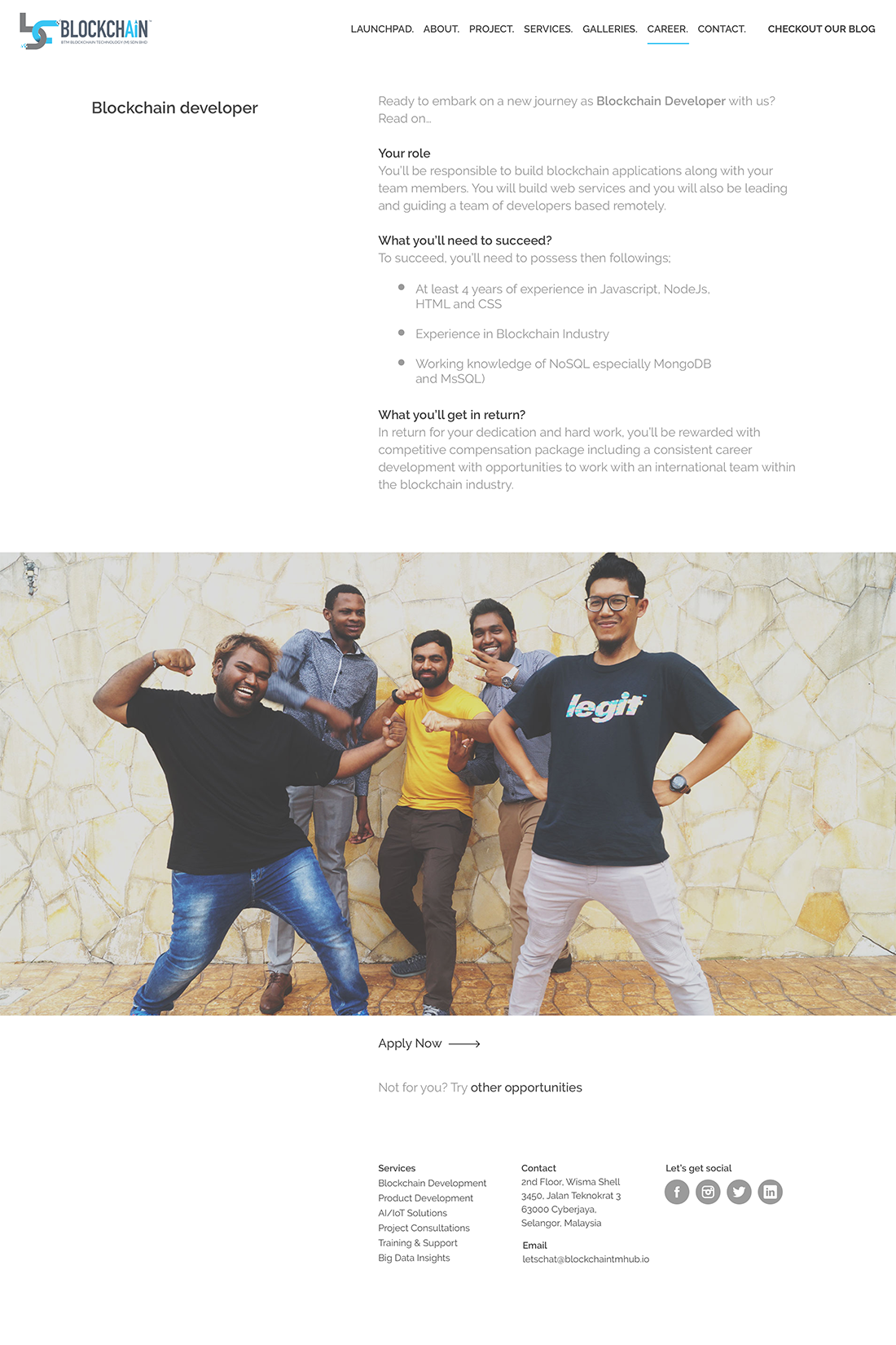
Oftentimes, website owners would like to show and cramp as much as information in one page or screen, fearing that their visitors missed any information that they wanted to convey. This approach has never been a good UX practice and most of the times, visitors are lost due to cluttered information on the layout. So, instead of showing "everything", the page or screen actually shows "nothing"!
For this website, the page designs and content structures are carefully planned in order to create a steady information flow for the visitors. Minimal and soft colors were used, creating a nice ambience that is pleasing to the eyes. Rows and columns were carefully planned so that the visitors can really focus on the content and their messages.
For this website, the page designs and content structures are carefully planned in order to create a steady information flow for the visitors. Minimal and soft colors were used, creating a nice ambience that is pleasing to the eyes. Rows and columns were carefully planned so that the visitors can really focus on the content and their messages.
// Speak Human
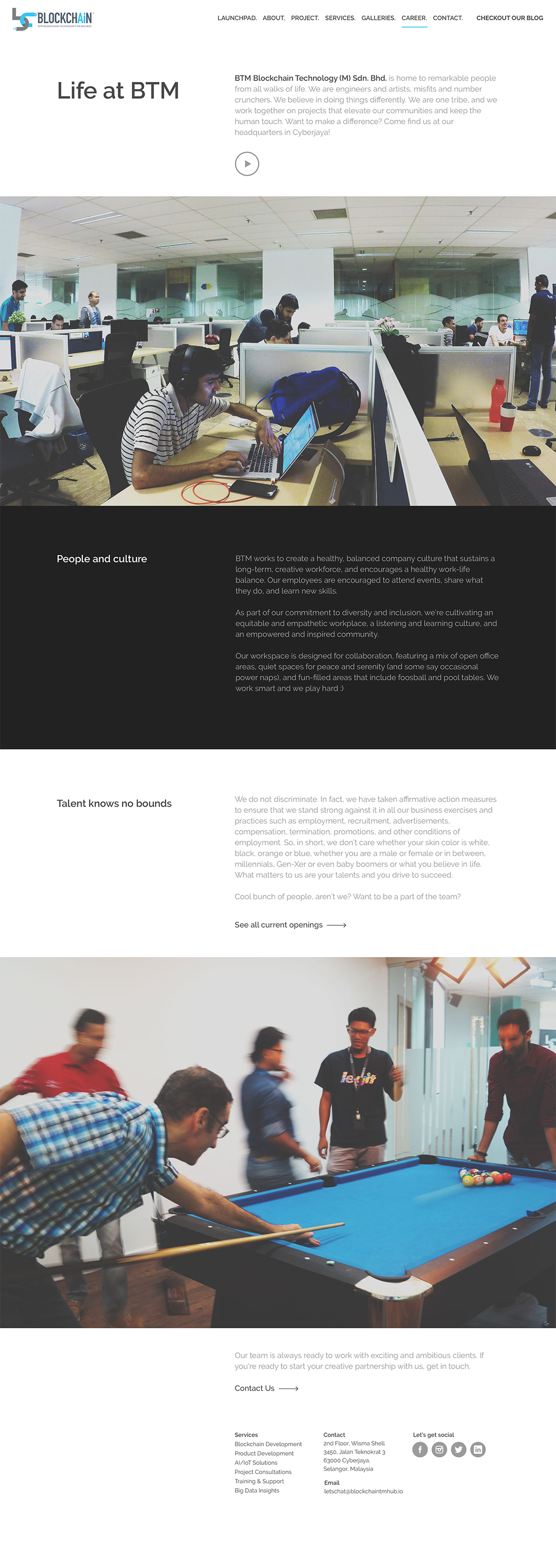
Treating the visitors as they are - as human.
The voice used on this website carries a more approachable and friendly tone. In short, the whole write-up structure tries to speak in natural ways that is casual and at the same time, easy-to-understand. The design pays close attention to each of the content length so that they are not too short or too long - they are just enough to convey the vital information for the visitors.
// Conclusion
A corporate website that educates, showcases the organisation strength and also promoting its culture
This website design does not follow the normal approach used by most tech started during that time. The norm during that time, tech company needs to showcase all the techy approach with all the tech terms and jargons.
BTM Technology Malaysia has taken quite a risk by going on a different approach. However, it has served its purposes when it managed to attract the right investment - opening up opportunities for the company in a new market and also attract the right talents to join the company.
BTM Technology Malaysia has taken quite a risk by going on a different approach. However, it has served its purposes when it managed to attract the right investment - opening up opportunities for the company in a new market and also attract the right talents to join the company.